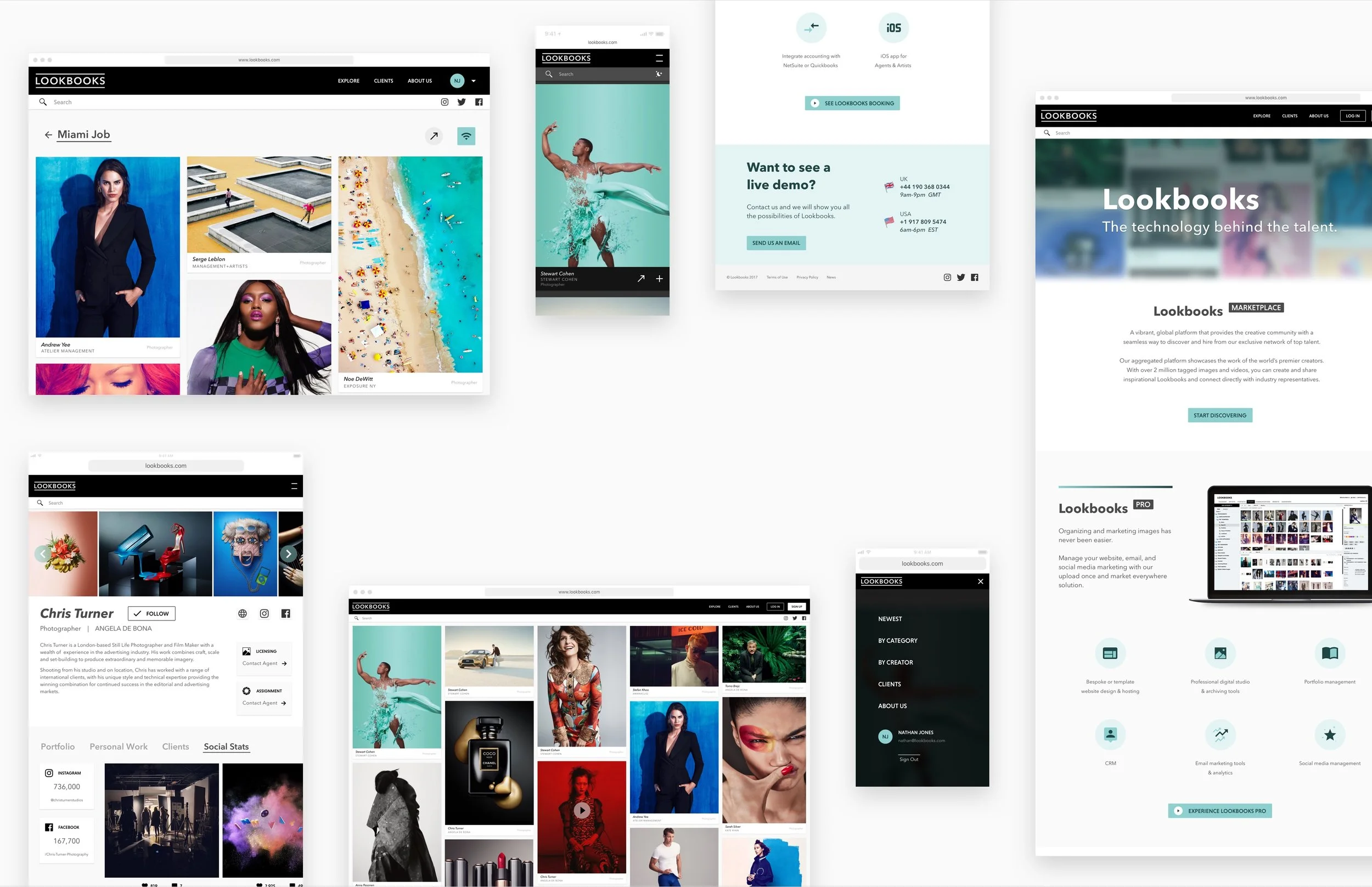
Lookbooks Hero.jpg

Lookbooks

Elevated design. Elevated engagement.


Motion

Prototyping

Brand Identity

Product Design

Creative Direction

User Experience Design


Lookbooks is a leading software provider to the creative arts industry. Art buyers, photographers and others visit the MarketPlace for trend updates and inspiration.

In 2016 their site and assets were in dire need of a modern update and fresh voice.

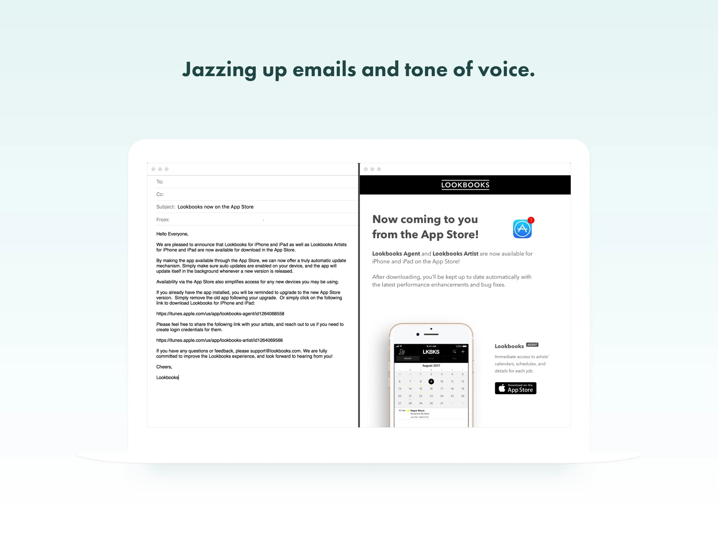
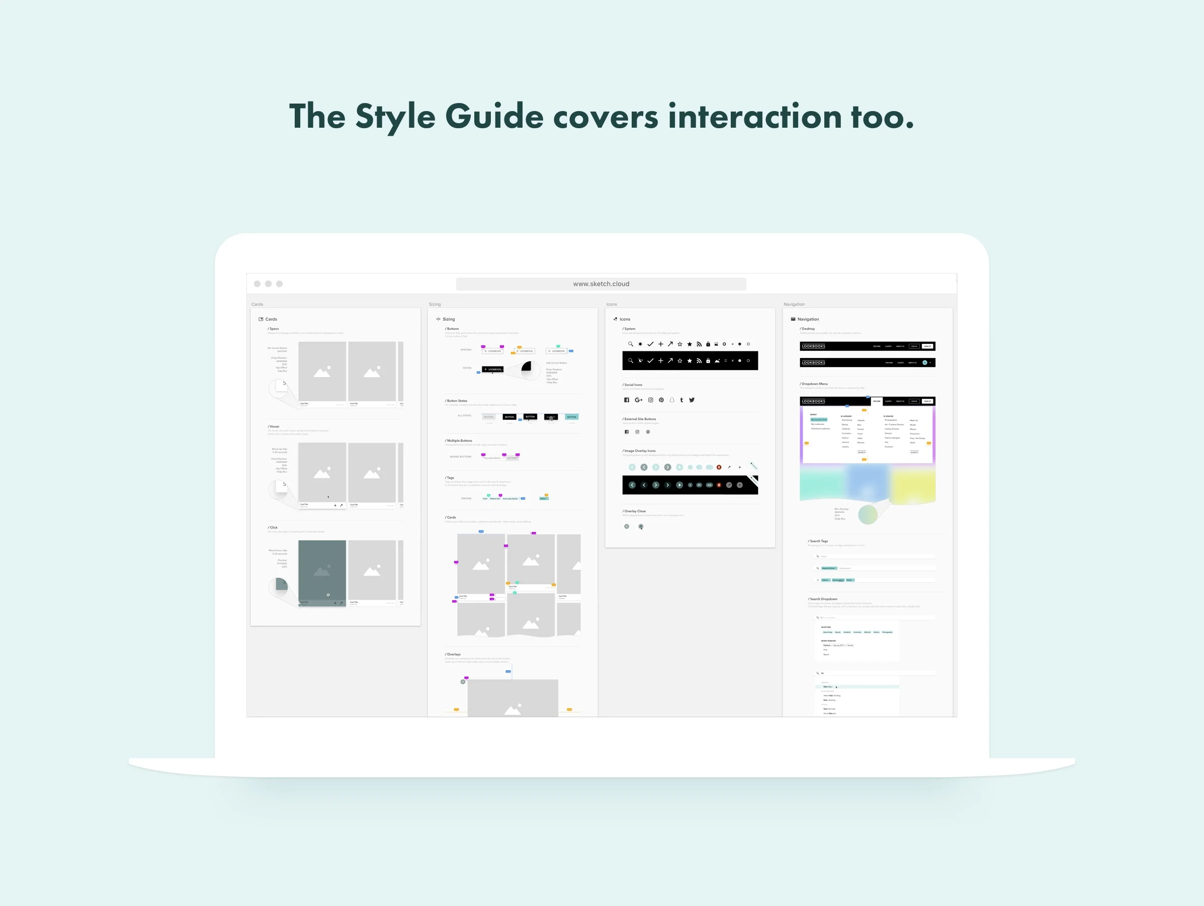
I worked with Lookbooks to redesign their website, create a Style Guide to unify branding, elevate the experience across communications, and increase engagement.



Solving for UX.

Solving for UX.

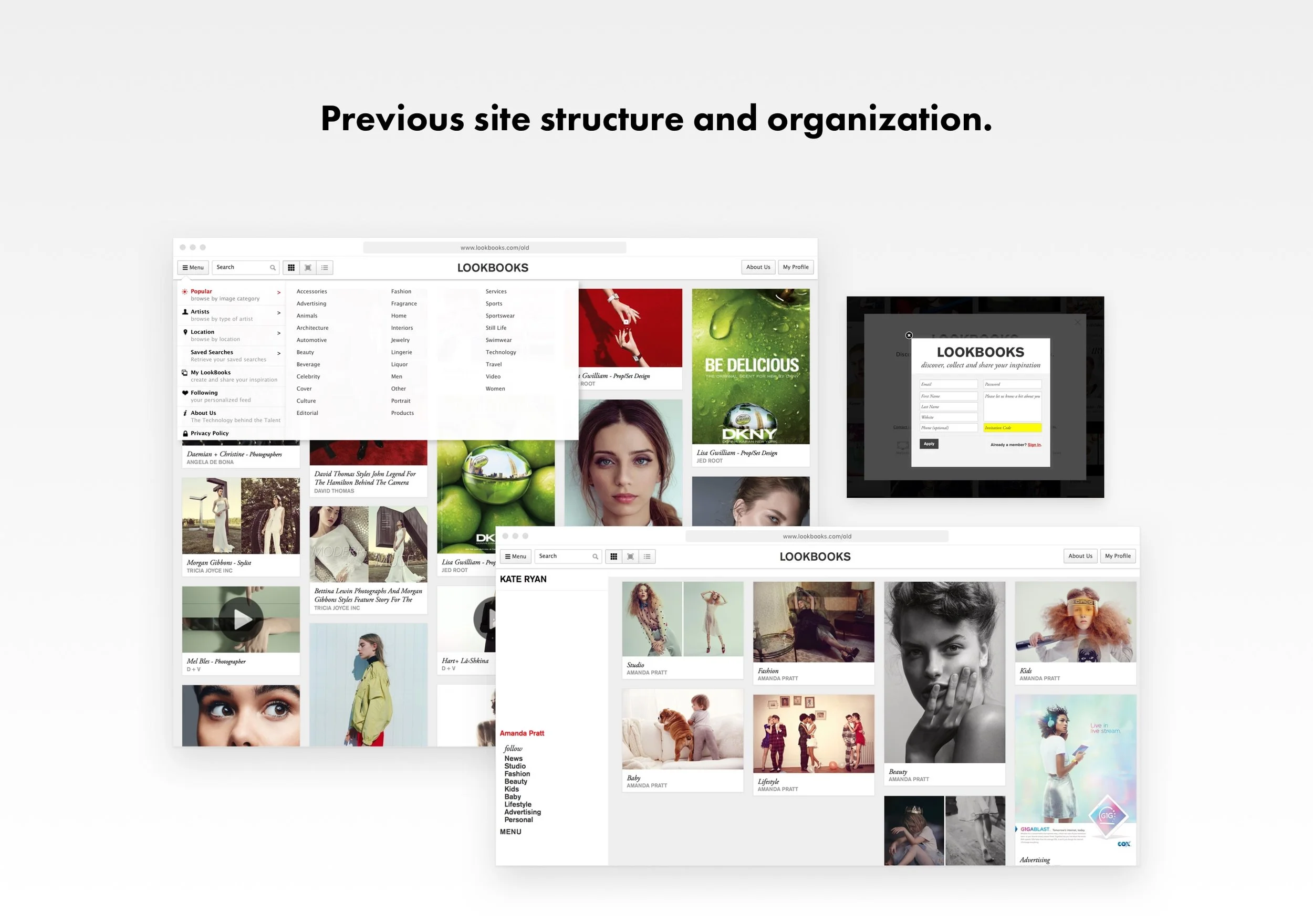
• The hamburger menu on desktop led to nested categories and artists.

• A confusing side menu with seemingly random type treatments appeared when browsing albums.

• The small search and hidden topics made discovery hard.

• Duplicitous items in the navigation begged for consolidation.

• Modal on modal should be illegal.


Aspirational to reality.

Aspirational to reality.

Leading an exercise across teams, I gathered the aspirational words describing the company, its products, and its future to define the visual path forward. "Easy to use," "innovative," "creative," "influential," and "stylish" were the basis for color schemes, branding updates, UX decisions, and tone of voice in copy.


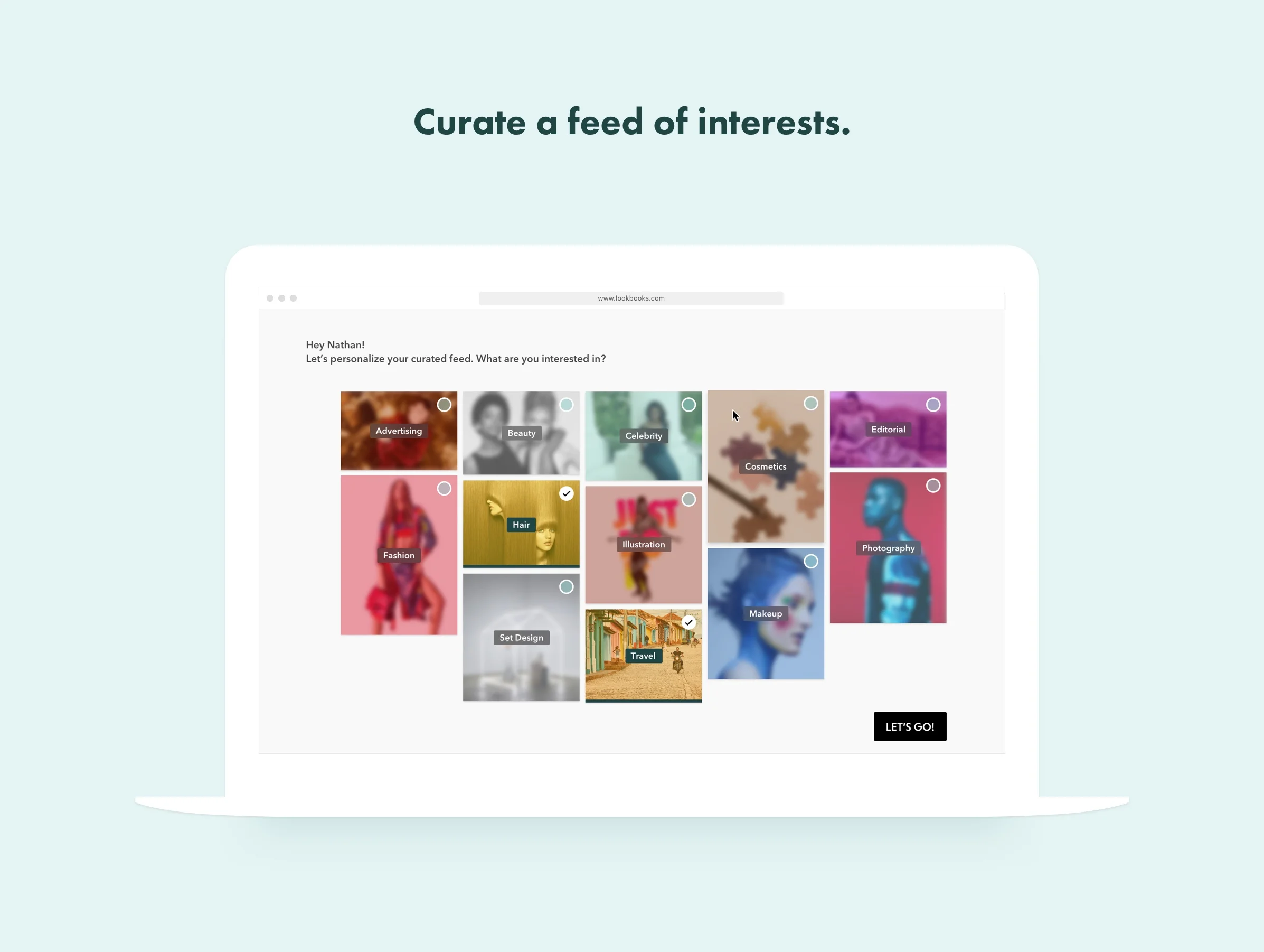
Lookbooks - Set Up Curated Feed.jpg
Colorfully lacking.

Colorfully lacking.

Black and white is the best at showing off the vibrant range of creative work on the MarketPlace. So for the accent color we went with a robin egg shell blue – a hint of blue references technology and winks at the the luxury world of Tiffany and The Great Gatsby. 


Lookbooks - Style Guide Copy.jpg
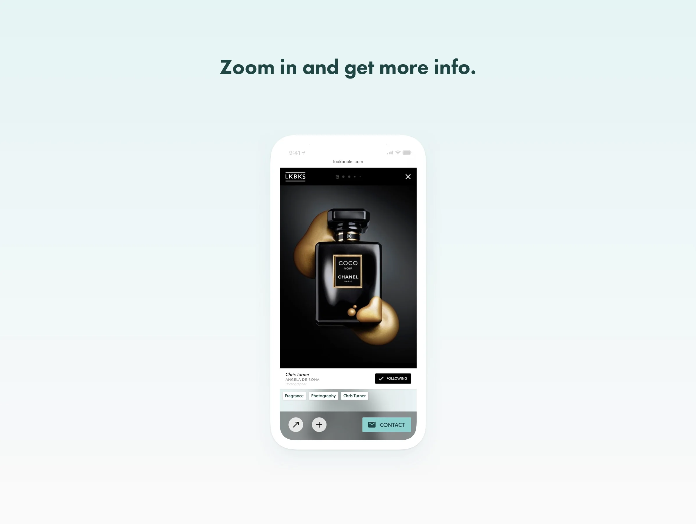
Lookbooks - Mobile Zoom Copy.jpg
Cause and effect.

Cause and effect.

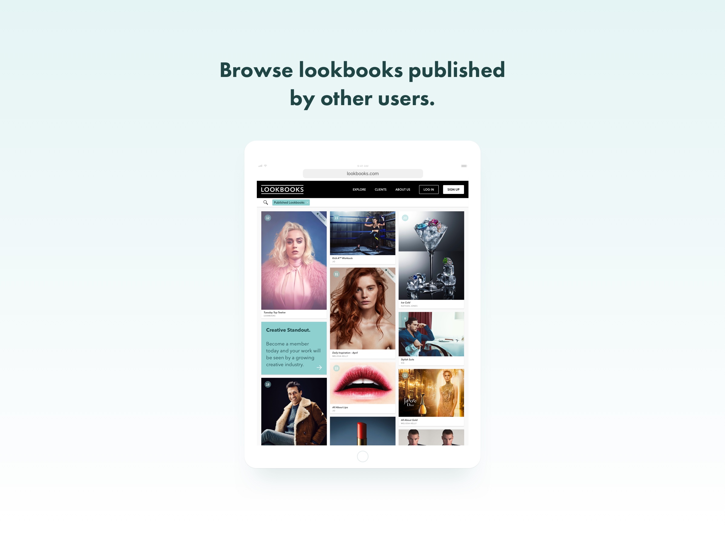
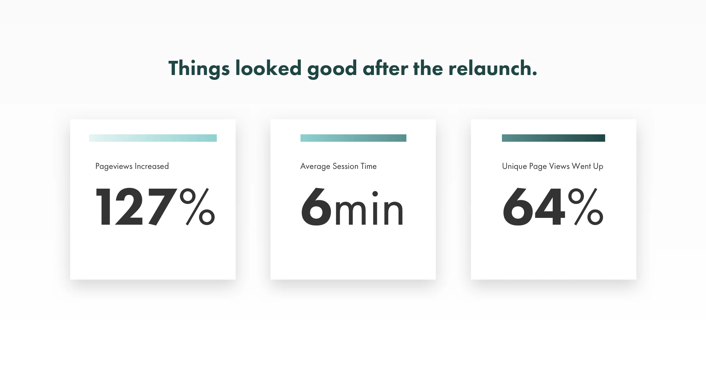
Comparing the three months before and after the launch, page views and MarketPlace interaction time both increased. Exposure to highlighted categories and agencies grew up to 20x thanks to a new explore menu.